

Year:
Year:
Year:
2023
2023
2023
Type of work:
Type of work:
Type of work:
Client Project,
Property of Liquidink Design
Client Project,
Property of Liquidink Design
Client Project,
Property of Liquidink Design
Zenova a new standard in eV tech
Zenova a new standard in eV tech
Zenova a new standard in eV tech
Zenova a new standard in eV tech
Zenova delivers a seamless EV subscription experience, embodying simplicity and innovation.
Zenova delivers a seamless EV subscription experience, embodying simplicity and innovation.
Zenova delivers a seamless EV subscription experience, embodying simplicity and innovation.
Zenova delivers a seamless EV subscription experience, embodying simplicity and innovation.
Zenova is an electric vehicle (EV) subscription app that embodies the principles of Zen philosophy and minimalism. The brand's commitment to simplicity and efficiency is evident in every aspect of its design and service, from the app interface to the typography and color palette. This holistic approach ensures that users enjoy a seamless and intuitive experience, making car subscription as easy as possible.
The goal was to create a user interface that conveys the essence of the service with minimal steps, ensuring that booking a car is only a click away. This attempt to focus on minimalism did not compromise functionality; instead, it enhanced the user experience by reducing cognitive load and making interactions straightforward and intuitive.




Zenova's branding is a masterclass in minimalism and efficiency.
Zenova's branding is a masterclass in minimalism and efficiency.
Zenova's branding is a masterclass in minimalism and efficiency.
Zenova's branding is a masterclass in minimalism and efficiency.
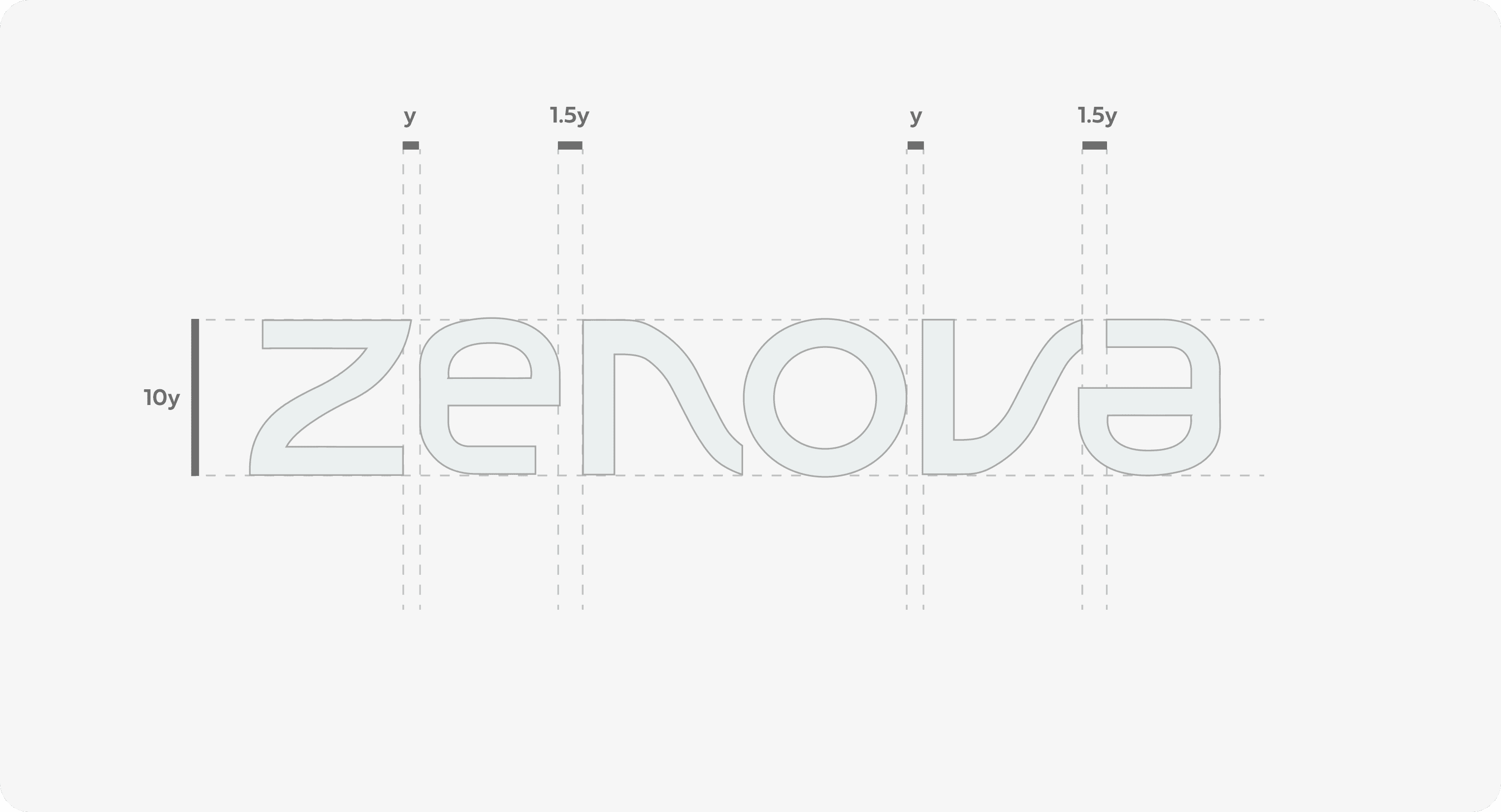
The identity is deeply rooted in the innovative approach of deriving the entire identity from a few core alphabets. This unique method ensures that every element of Zenova's branding remains cohesive and consistent, reflecting the brand's commitment to Zen philosophy and simplicity.
The branding features clean lines and streamlined forms, embodying the essence of simplicity. Each brand collateral is crafted with minimal adjustments, creating a cohesive and harmonious visual identity. Every aspect of Zenova's visual identity, from the logo to the typography and even the user interface design, follows this principle of ‘Less is More’.




In Zenova's branding philosophy, 'less is more' means every element is purposefully minimal.
In Zenova's branding philosophy, 'less is more' means every element is purposefully minimal.
In Zenova's branding philosophy, 'less is more' means every element is purposefully minimal.
In Zenova's branding philosophy, 'less is more' means every element is purposefully minimal.
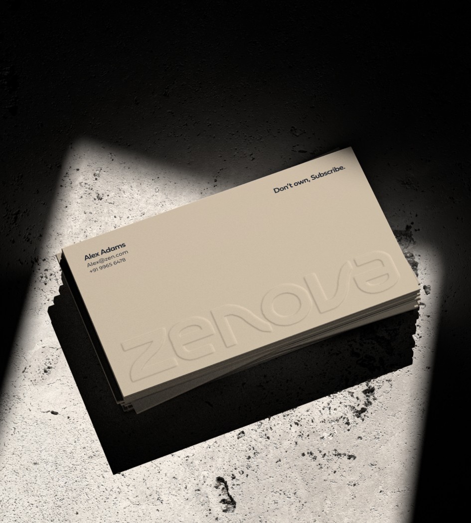
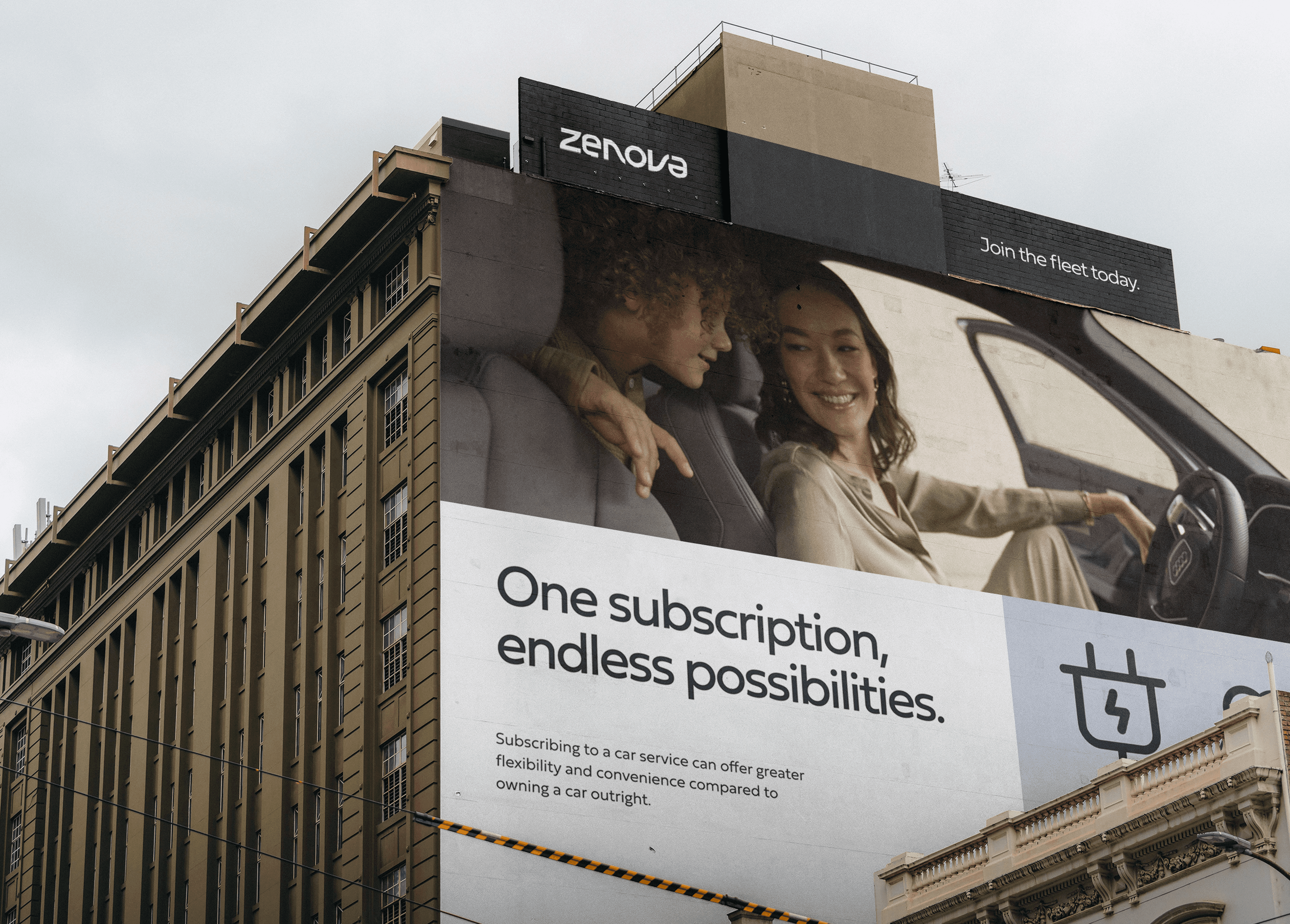
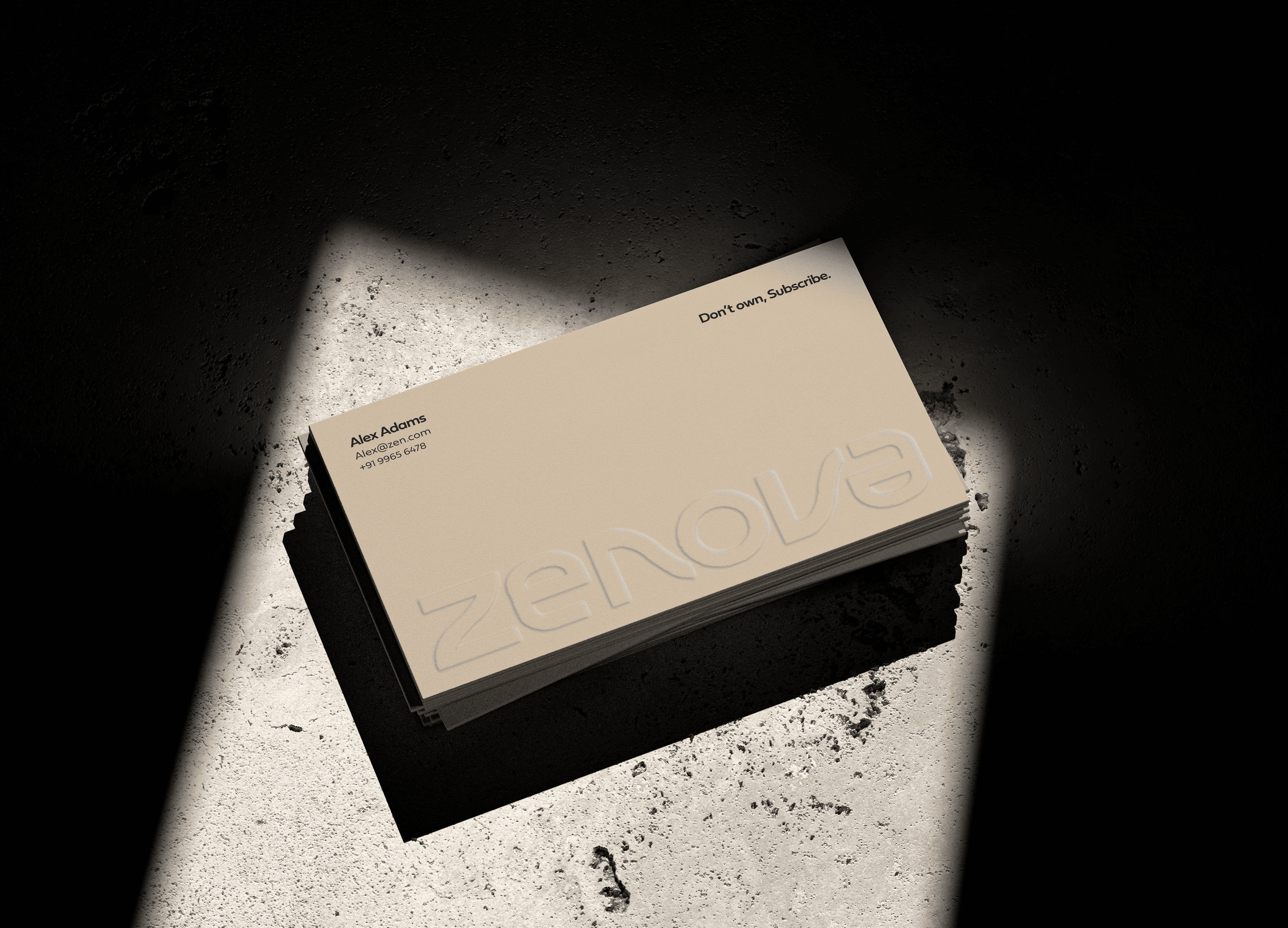
In Zenova's collaterals, the 'less is more' philosophy is evident in every detail. Whether it's print or digital assets each element is designed to communicate essential information without unnecessary embellishments.
All assets are designed with simplicity in mind. Bold, clean visuals and concise messages ensure maximum engagement and retention. Across all digital platforms, the branding remains consistent, providing a unified look and feel that is truly rooted in its story and vision. This consistency reinforces brand recognition and trust.





Zenova’s design language is a whisper of calm in a world that often shouts.
Zenova’s design language is a whisper of calm in a world that often shouts.
Zenova’s design language is a whisper of calm in a world that often shouts.
Zenova’s design language is a whisper of calm in a world that often shouts.
Color and typography are the two important pillars of Zenova's design language, both intricately derived from the core automobile driving experience. These aspects are not merely aesthetic choices but are deeply rooted in the essence of movement, which is central to Zenova's brand identity.
The color palette of Zenova is inspired by the dynamic and energetic nature of automobiles. Colors are chosen to reflect the movement and flow associated with driving, capturing the vibrancy and excitement of the journey. This palette not only adds visual appeal but also conveys a sense of motion and progress, aligning with Zenova's mission to provide access to innovative and eco-friendly transportation solutions.

Pay Monthly
Pay Monthly
Pay Monthly
Pay
monthly
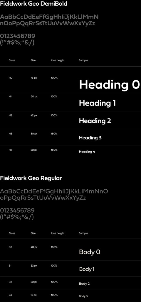
The chosen typeface, Fieldwork, embodies boldness and modernity while maintaining clarity and readability. Each letter is crafted to reflect movement, with subtle variations that add dynamism and energy to the text. This approach ensures that every piece of written content communicates the brand's values effectively while enhancing the overall user experience.
The chosen typeface, Fieldwork, embodies boldness and modernity while maintaining clarity and readability. Each letter is crafted to reflect movement, with subtle variations that add dynamism and energy to the text. This approach ensures that every piece of written content communicates the brand's values effectively while enhancing the overall user experience.
The chosen typeface, Fieldwork, embodies boldness and modernity while maintaining clarity and readability. Each letter is crafted to reflect movement, with subtle variations that add dynamism and energy to the text. This approach ensures that every piece of written content communicates the brand's values effectively while enhancing the overall user experience.



The wireframing process was a seamless path to simplicity
The wireframing process was a seamless path to simplicity
The wireframing process was a seamless path to simplicity
The wireframing process was a seamless path to simplicity
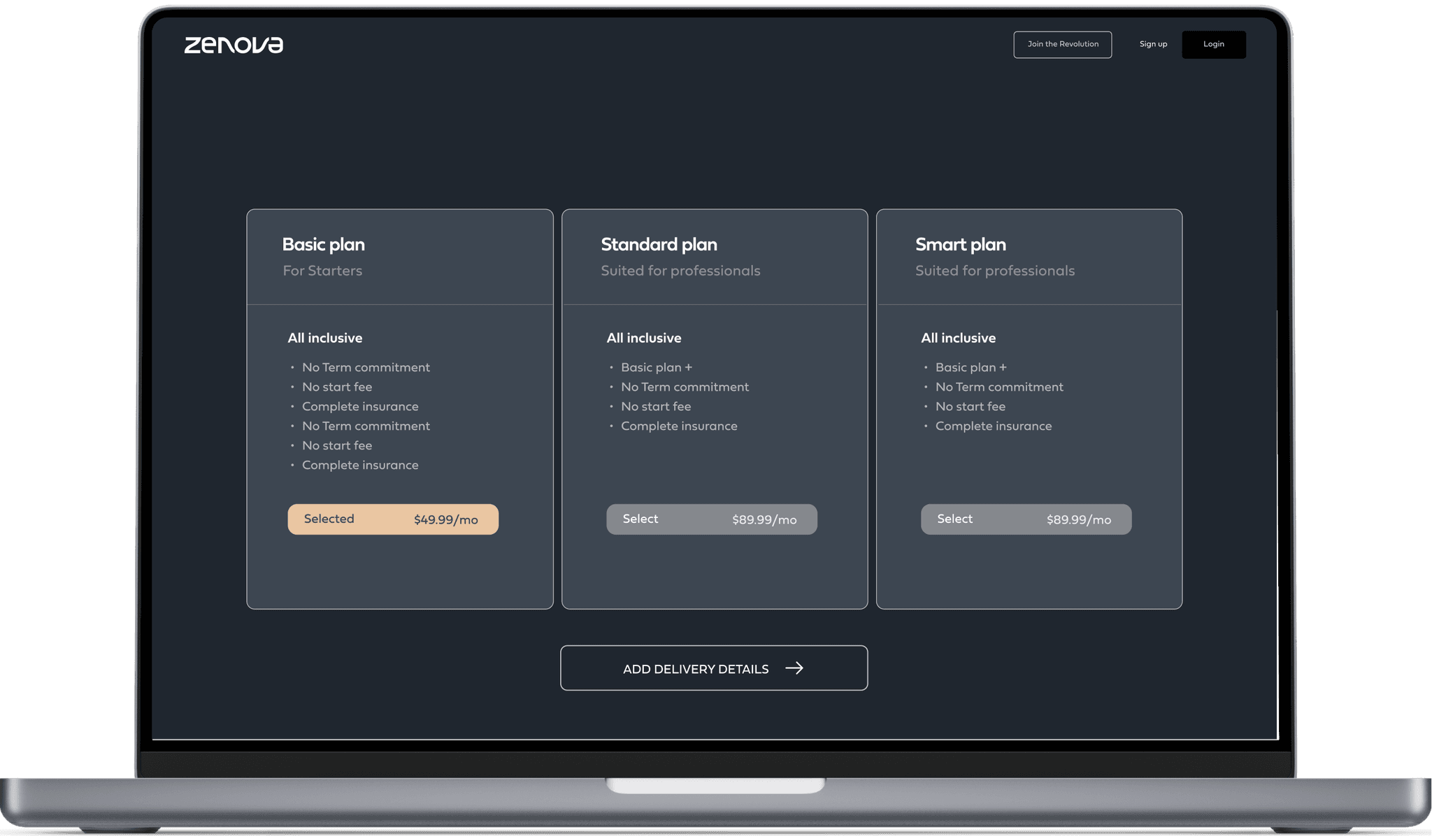
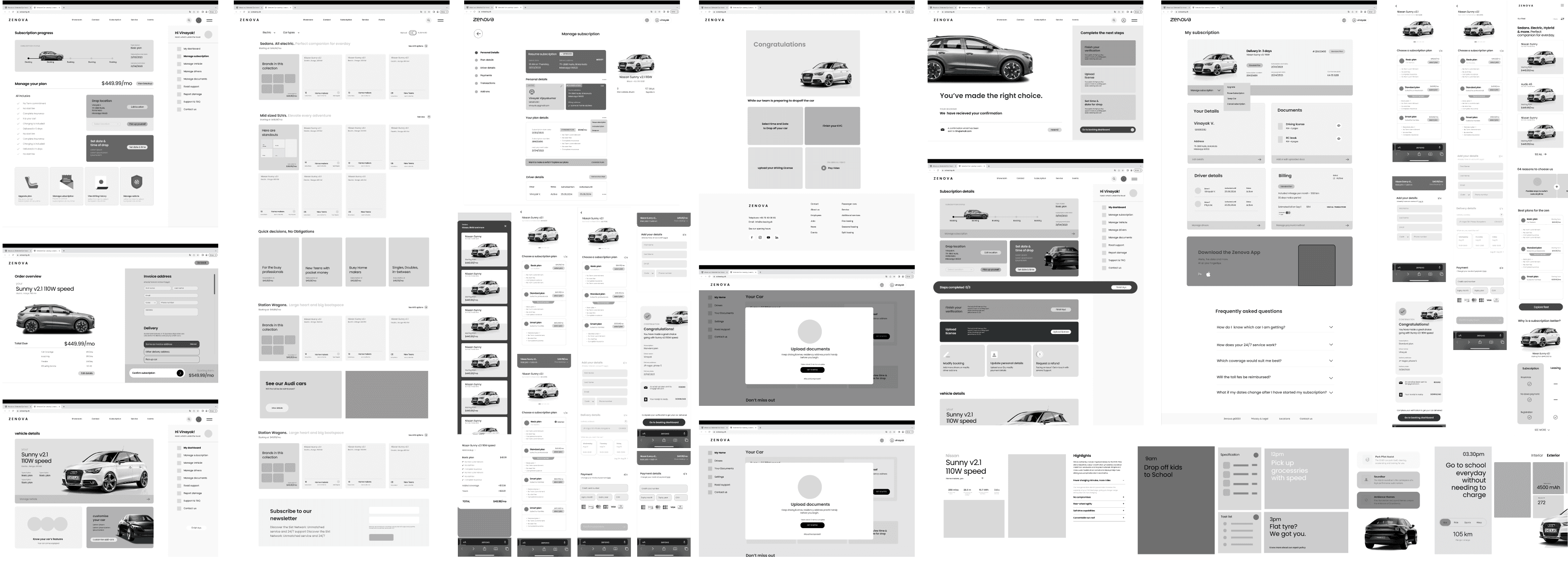
Zenova's wireframes were developed with responsiveness as a primary consideration. This means that whether users access the website from a desktop computer, tablet, or smartphone, the layout adjusts fluidly to provide an optimal viewing and interaction experience.
The entire wireframing process for Zenova was meticulously executed with the philosophy that every step matters. The goal was to ensure that users could navigate through the entire process seamlessly, empowering them to reach their destination without feeling burdened by complex decisions. Every element was designed to make the user journey intuitive and stress-free, reflecting Zenova's commitment to simplicity and clarity.
Zenova's wireframes emphasize a strong visual hierarchy and a clean design aesthetic. Key information and functionalities are prominently displayed, using strategic spacing, typography, and color contrast. This approach helps guide users intuitively through the website, making navigation straightforward and content easy to digest.


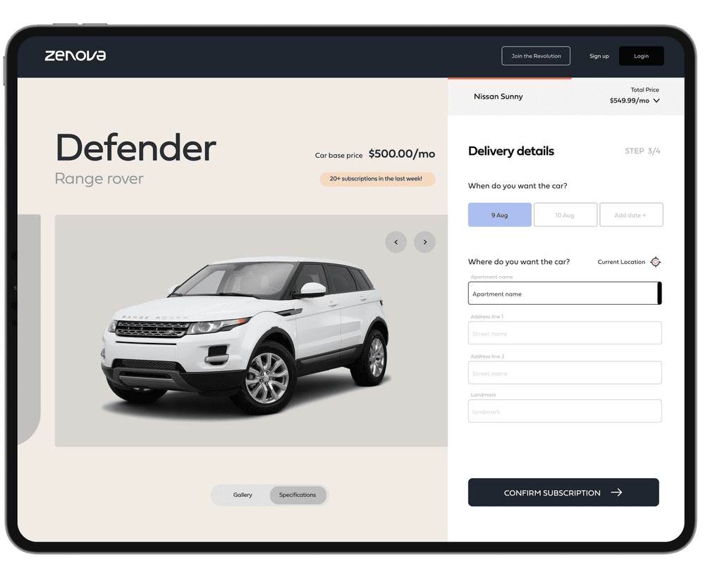
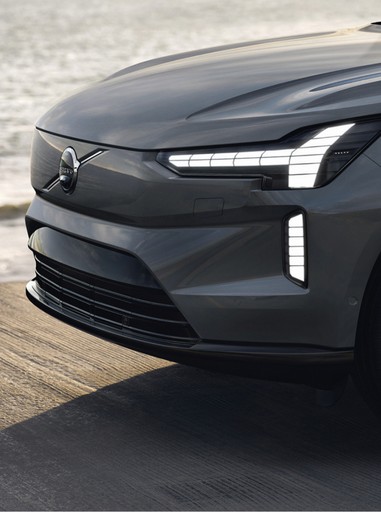
The final visual design for Zenova’s website brings together all the branding elements we've discussed, solidifying them with a robust UX framework. It integrates Zenova's brand colors seamlessly, placing striking images at the center to remind users that Zenova is not just a service, but a lifestyle. This cohesive approach ensures that every interaction is a reflection of Zenova's commitment to simplicity, elegance, and the driving experience.
At it’s heart is a user-centric approach. The design team prioritized understanding the needs and behaviors of their users, resulting in a platform that is easy to navigate and highly responsive. The website's layout ensures that users can find the information they need quickly and efficiently, without unnecessary distractions.


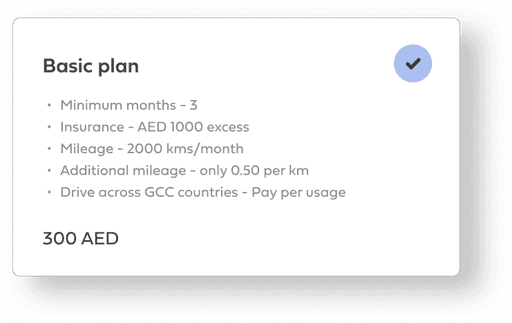




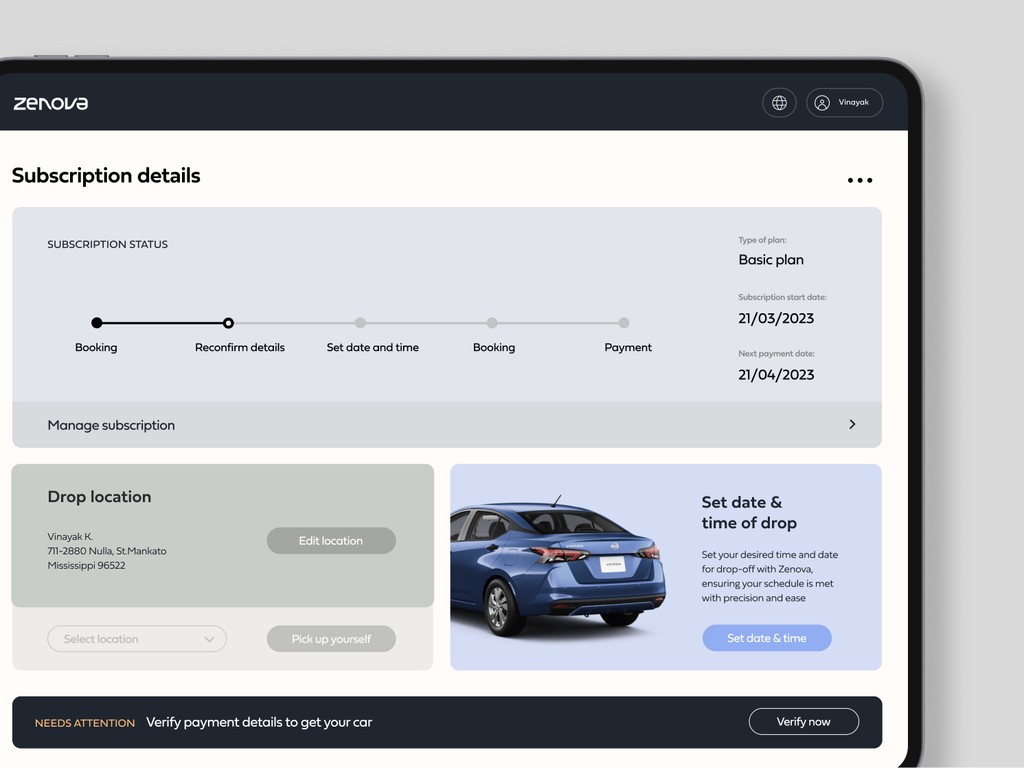





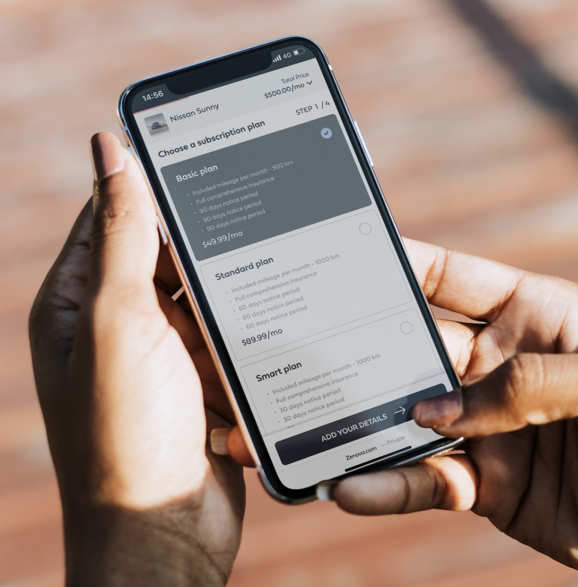
Zenova's key screens are designed with a user-first approach, ensuring that the decision-making process for booking a car is as seamless and stress-free as possible. The interface combines modern, new-age aesthetics with intuitive functionality, reassuring users that their future is in capable hands. This design sensibility makes Zenova stand out in the market, offering the most contemporary yet approachable experience.
This balance ensures that users of all tech-savviness levels can navigate the app with ease, making car booking an accessible process for everyone. By leveraging modern design principles, Zenova reassures users that they are making the right choice. The polished and professional look of the website reflects the reliability and quality of Zenova's service. Users can trust that they are in good hands, supported by a platform that values their time and needs.
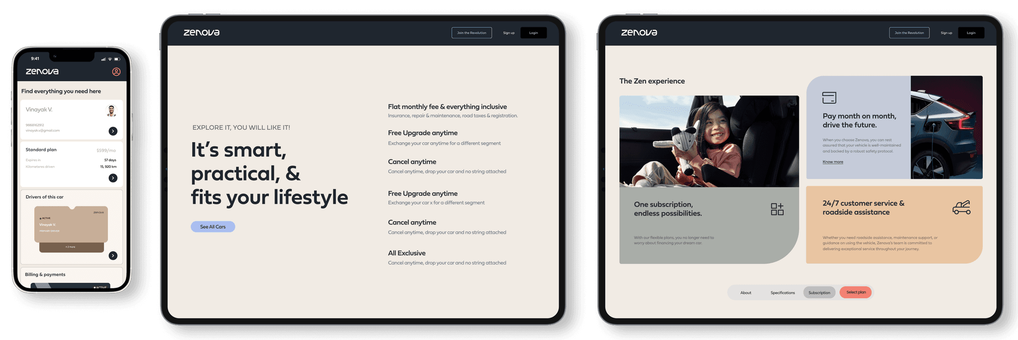


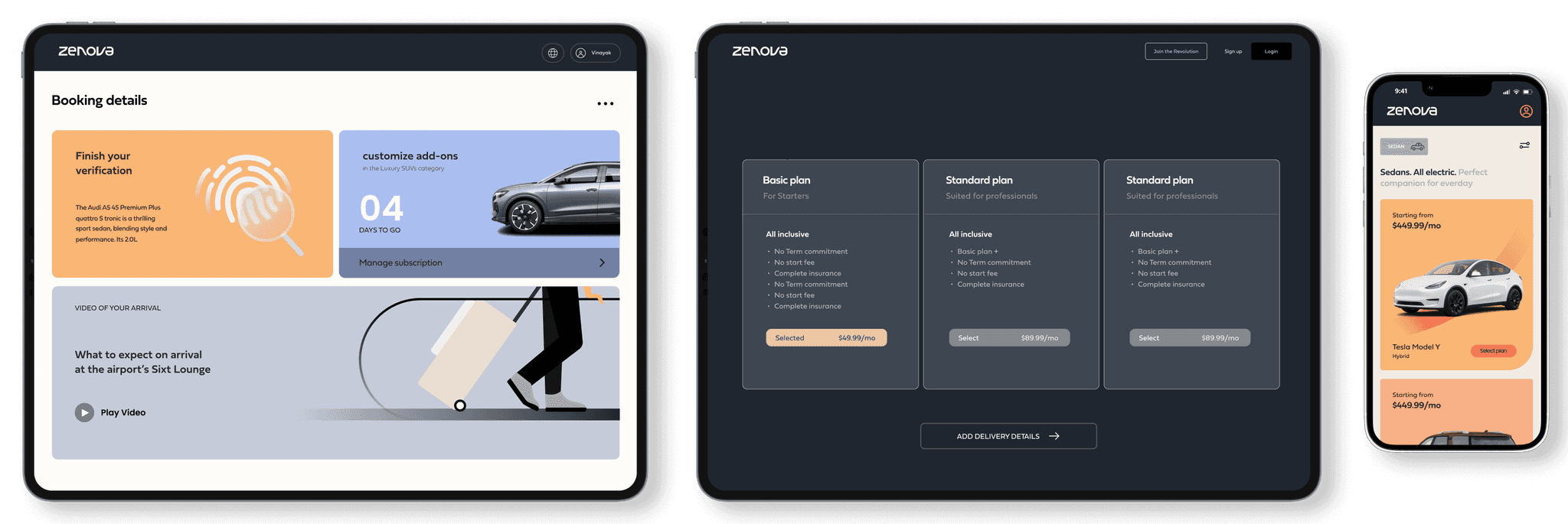


Embracing the Zenova lifestyle of modernity and ease.
Embracing the Zenova lifestyle of modernity and ease.
Embracing the Zenova lifestyle of modernity and ease.
Embracing the Zenova lifestyle of modernity and ease.
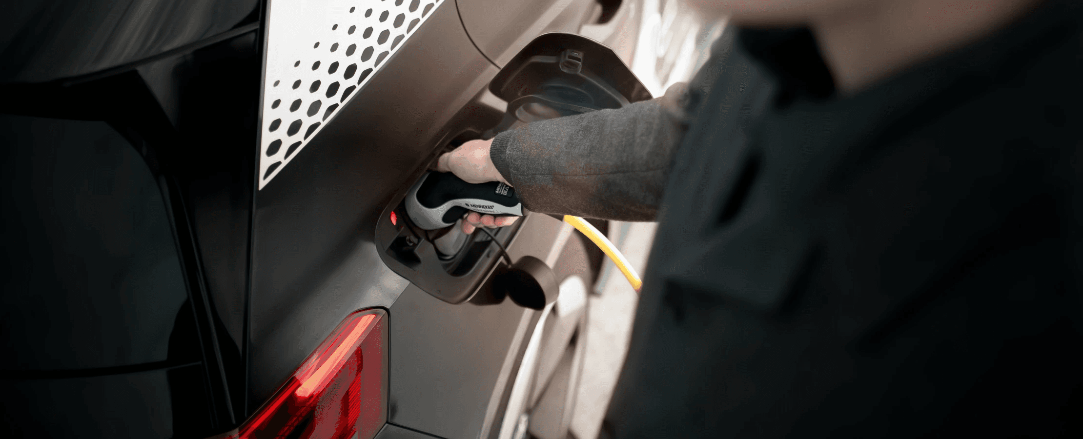
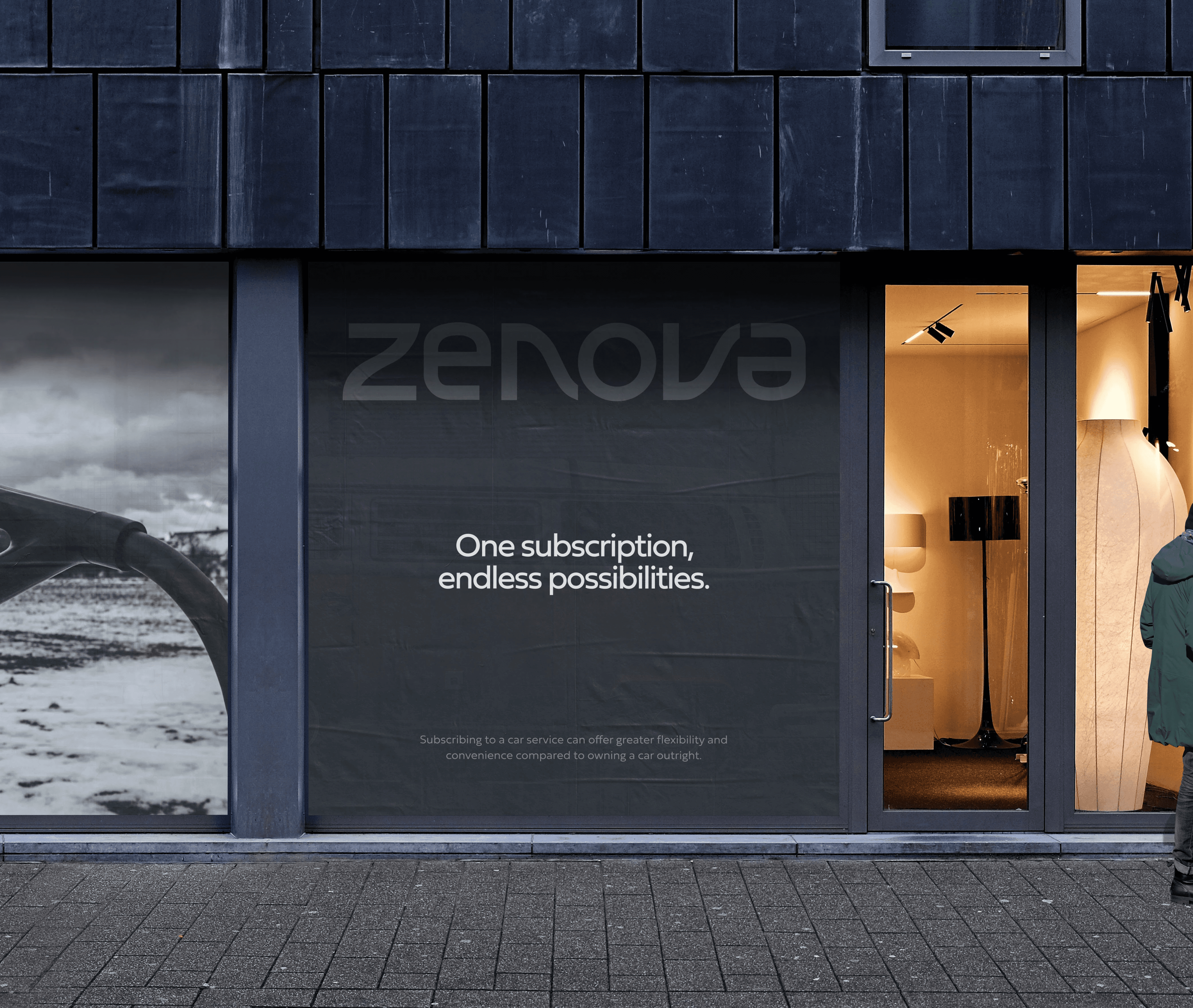
The Zenova lifestyle is about more than just driving; it's about embracing a modern, efficient, and elegant way of life. By prioritizing simplicity, sustainability, and personalization, Zenova offers a car subscription service that fits seamlessly into the lives of its users.
With every interaction, from booking to driving, Zenova reinforces its commitment to providing a superior experience that reflects the best of contemporary living.








Tools used:
Tools used:
Tools used:
Team:
Team:
Property of Liquidink Design
Property of Liquidink Design
Concept note:
Concept note:
Concept note:
By adhering to the Zen philosophy, Zenova has created a platform that not only simplifies the car subscription process but also offers a modern and aesthetically pleasing user experience.
This case study is a testament to the importance of integrating core brand values into every aspect of digital design and user interaction.
Team:
Property of Liquidink Design